Roku UI/UX Redesign
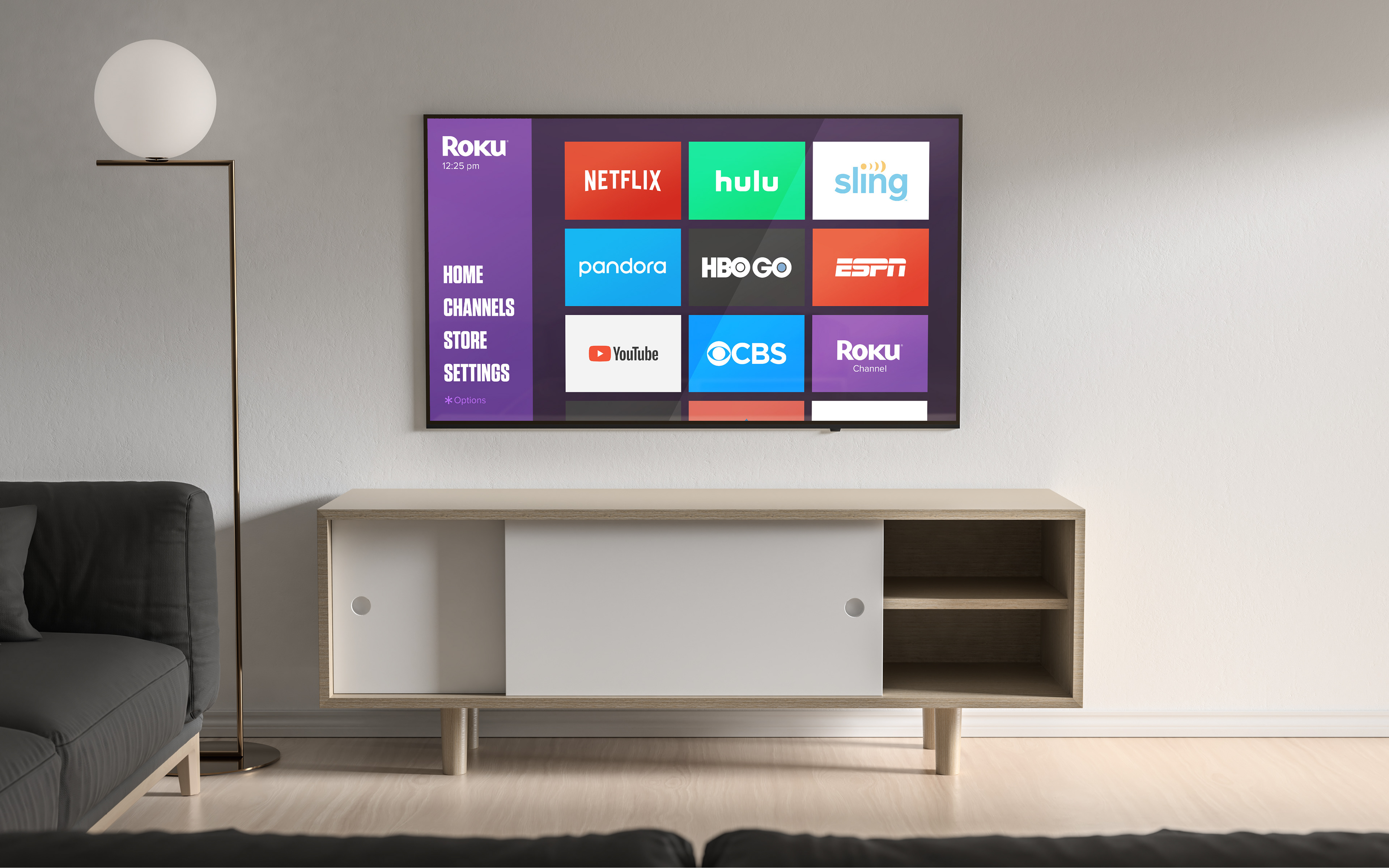
I've always been interested in UI/UX design, so I decided to dip my toes in with an unsolicited redesign of Roku's home screen. I love my Roku, but its interface feels a tad outdated for my taste. For those unfamiliar, here's a link to the current Roku home screen design.
Animated it from wake-up to channel selection:
And since I don't want to just animate the "fun" stuff - here it is from wake up to navigating deep into the settings menu.
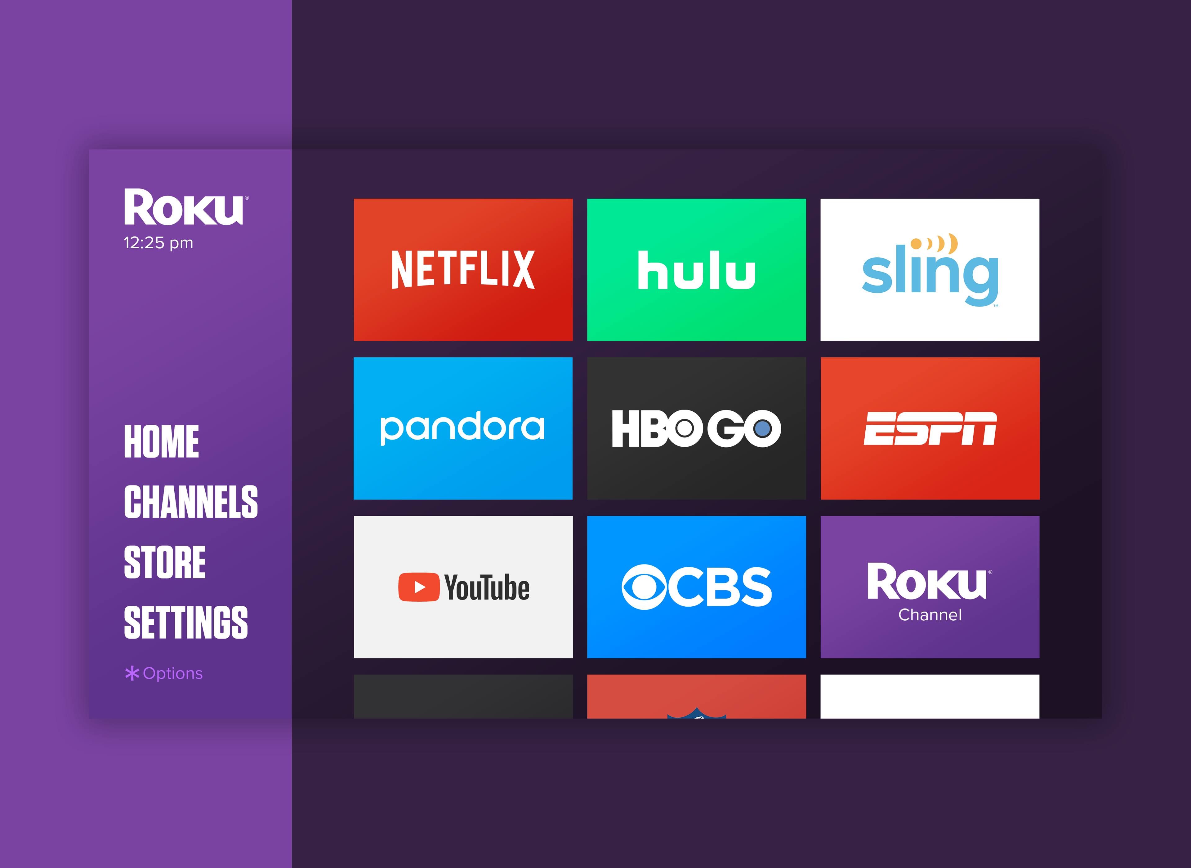
The fundamental idea is to put the most relevant information at the forefront and keep a consistent 1/5 + 4/5th column layout. So the 'options' menu, as well as the time and watermark, are all nested on the left and viewable at a glance. The text size is also increased for added visibility, and the backgrounds of each column get a subtle gradient.